Most businesses treat website launches like finish lines. They celebrate going live, pop champagne, and expect customers to flood in. But here's the harsh truth: the majority of small business websites fail long before anyone ever sees them.
These failures aren't dramatic. There's no error message. No crash. Just silence. Low traffic, zero conversions, and eventually a redesign request two years later wondering what went wrong.
The problem starts months before launch. It begins with assumptions, shortcuts, and design trends that look impressive in portfolios but don't serve actual customers. A successful website launch isn't about making it live. It's about making it work.
Let me show you exactly where most business websites go wrong, and more importantly, how to get it right.
The Inside-Out Design Trap
Most business websites are built backward. Companies start by asking what they want to show instead of what visitors need to experience. This inside-out approach kills conversions before they start.
Here's what typically happens: a business owner meets with a designer and says "We need to show our 30 years of experience, our six service categories, and our company values." The designer nods, creates a homepage that checks all those boxes, and everyone feels satisfied.
Then the site goes live and crickets.
Why? Because visitors don't care about your timeline. They care about their problem. When someone lands on your site, they're asking one question: "Can you help me?" If your homepage makes them hunt for that answer through corporate history and mission statements, they leave.
Successful websites flip this equation. They start with user behavior research. Who visits your site? What problem brought them there? What information do they need to make a decision? How do they prefer to consume content?
User-Centered Design in Action
A local HVAC company rebuilt their site after tracking user behavior. They discovered 73% of visitors arrived searching for emergency repair. Their old homepage featured company awards and service areas. The new homepage leads with "Emergency AC Repair: Same-Day Service Available" and a prominent phone number. Conversion rate jumped 156%.
This isn't about removing company information. It's about sequencing it correctly. Lead with value. Prove you can solve their problem. Then build credibility with experience and testimonials.
Every design decision should answer: does this help visitors accomplish their goal? If the answer is "no, but it looks cool," cut it. Beauty without function is decoration, not design.
Performance: The Silent Killer
You can have the most beautiful website in your industry. Perfect color scheme, stunning imagery, elegant animations. But if it takes seven seconds to load, you've already lost.
Performance isn't a technical detail. It's a business metric that directly impacts revenue. Google research shows that 53% of mobile visitors abandon sites that take longer than three seconds to load. Every additional second of delay can reduce conversions by up to 20%.
Think about your own behavior. When you click a link and stare at a blank screen, how long do you wait? Three seconds? Five? Most people tap back after two. Your customers are no different.
Yet countless business websites launch with bloated code, unoptimized images, and render-blocking scripts that destroy the user experience. The owner sees a beautiful design on their office computer with high-speed internet and assumes everyone else sees the same thing.
They don't.
Mobile users on spotty connections see loading spinners. Search engines see slow page speed scores and rank accordingly. Potential customers see your competitor's site that loaded instantly.
The Real Cost of Slow Sites
Amazon calculated that every 100ms of latency costs them 1% in sales. For a small business doing $500K annually, a two-second delay could cost $10,000 in lost revenue. Performance isn't optional anymore. It's survival.
Here's what actually slows sites down:
Unoptimized images are the number one culprit. A 5MB hero image looks crisp on a designer's 4K monitor but murders mobile performance. Modern formats like WebP reduce file sizes by 30-50% without visible quality loss. Every image should be compressed, properly sized, and lazy-loaded.
Third-party scripts create unpredictable performance. That fancy chat widget, social media feed, or analytics tag might add three seconds to your load time. Each script is another HTTP request, another render-blocking resource. Audit every third-party tool and ask: is this worth the performance cost?
Template bloat affects pre-built themes dramatically. Templates include CSS and JavaScript for features you'll never use, but your visitors download it anyway. A custom-built site using modern frameworks like Next.js delivers only the code each page needs, nothing more.
Server response time matters before users even see content. Cheap hosting with overloaded servers can add two seconds just waiting for the initial response. Quality hosting costs $20 more per month but saves thousands in lost business.
Performance optimization isn't one-time work. It's ongoing maintenance. Images get added. Features get built. Scripts accumulate. Schedule quarterly performance audits to catch issues before they hurt conversions.
The best part? Performance improvements compound. A fast site ranks better in search results, keeps visitors engaged longer, converts at higher rates, and costs less in advertising because landing pages work efficiently.
Speed is credibility. When your site loads instantly, users subconsciously trust you more. It signals professionalism, attention to detail, and respect for their time.
Copy That Converts vs. Copy That Confuses
Beautiful design attracts attention. Smart copy converts it into action. Yet most business websites launch with placeholder corporate speak that sounds professional but says nothing.
Let me show you what I mean. Here's actual copy from a failed website launch:
"Welcome to ABC Solutions. We provide innovative services to help businesses succeed in today's competitive marketplace. Our team of dedicated professionals leverages cutting-edge technology to deliver world-class results."
Sounds familiar, right? Now tell me: what does this company actually do? Who do they serve? What problem do they solve? You can't answer because the copy is meaningless fluff.
Compare that to effective copy:
"We build Next.js websites that load in under one second and convert 3x better than templates. Perfect for local businesses tired of slow, generic sites that don't generate leads."
This version tells you exactly what they do, who it's for, and why it matters. No buzzwords. No vague promises. Just clear value.
The Clarity Test
Show your homepage to someone unfamiliar with your business. Give them five seconds, then ask what you do. If they can't explain it clearly, your copy needs work. Clarity beats cleverness every time.
The problem starts with calls-to-action. "Learn More" is the laziest CTA in web design. Learn more about what? What happens when I click? Where does it go?
Vague CTAs create hesitation. Hesitation kills conversions. Your brain wants to know the outcome before committing to action. When websites force you to guess, friction increases and click-through rates plummet.
Effective CTAs are specific and action-oriented:
- "Get Your Free Quote" tells visitors exactly what happens next
- "Book Your Table" eliminates ambiguity for restaurants
- "Start Your Project" signals the beginning of a process
- "Download the Guide" promises immediate value
- "Schedule Your Consultation" sets clear expectations
Each of these reduces cognitive load. Visitors don't have to think or guess. They know precisely what clicking delivers.
But CTAs are only half the equation. The copy leading to them must build intent. This is where most websites fail spectacularly.
Consider the typical "About Us" page. It lists company history, founder backgrounds, and mission statements. That's inside-out thinking again. Visitors reading your About page are evaluating trust, not researching your timeline.
Reframe it: "Why choose us?" becomes the question. Answer it with client results, unique methodology, and proof of expertise. History matters only when it demonstrates experience solving problems they have.
Service descriptions suffer similar issues. Technical jargon impresses peers but confuses customers. Write for the person who needs help, not the person who already understands the solution.
A dentist explaining "We provide comprehensive prosthodontic services" loses patients. "We restore damaged teeth so you can eat, speak, and smile confidently" connects with the actual problem.
Every sentence should either build value or drive action. If it does neither, delete it. Ruthlessly cut fluff. Your visitors' attention is expensive. Don't waste it.
The Testing Desert
Most websites launch untested. Developers check that links work and forms submit, then call it done. This is like test-driving a car by turning the key and assuming everything else works.
Real usability testing reveals how actual humans interact with your interface. And humans are wonderfully unpredictable. They misinterpret labels, miss obvious buttons, and abandon processes for reasons you'd never imagine.
I've watched users spend 30 seconds hunting for a phone number displayed prominently in the header. Why? Because it was styled as a button, and they expected phone numbers to be text. Simple design choice, massive usability impact.
Common issues found in testing:
Mobile navigation failures are epidemic. A menu that works perfectly on desktop becomes impossible to use on mobile when touch targets are too small or dropdowns behave unexpectedly. Test on real devices, not just browser resize tools.
Form validation disasters kill conversions silently. A contact form that rejects valid phone numbers or clears all fields after one error frustrates users into leaving. Test every field with various inputs, especially edge cases.
Content hierarchy confusion happens when visitors can't find critical information. Eye-tracking studies show people scan in F-patterns, but many designs fight this natural behavior. Important content buried below the fold might as well not exist.
Broken responsive breakpoints create weird layouts at certain screen sizes. Everything looks perfect at 375px and 1920px, but at 768px text overlaps images and buttons disappear. Test at multiple sizes, especially common tablet dimensions.
Loading state gaps leave users confused. A button that doesn't show processing state makes people click multiple times, breaking the process. Every action should provide immediate visual feedback.
Real Testing Failure
A law firm launched with a contact form that worked perfectly in testing. Within a week, they noticed zero submissions despite healthy traffic. The issue? The form validation rejected email addresses with plus signs, a common practice for filtering. Simple fix, but it cost them leads because they skipped diverse user testing.
Professional testing includes multiple layers:
Technical QA ensures functionality works as coded. Links navigate correctly, forms submit properly, and features behave consistently across browsers.
Usability testing watches real users attempt common tasks. Can they find your services? Complete a purchase? Book an appointment? You'll be shocked what people struggle with that seemed obvious to you.
Accessibility testing verifies your site works for everyone. Keyboard navigation, screen reader compatibility, color contrast ratios. This isn't just ethical, it's legal in many jurisdictions and expands your potential audience.
Performance testing under various conditions. Test on 3G networks. Test on older devices. Test with ad blockers enabled. Your site should degrade gracefully under stress, not break entirely.
Cross-browser testing catches inconsistencies. That fancy CSS animation might work in Chrome but break in Safari. Test at minimum Chrome, Firefox, Safari, and Edge.
Most importantly, test with real users from your target demographic. Your tech-savvy friend isn't representative. Get your site in front of people who match your actual customer base.
Testing reveals uncomfortable truths. That feature you spent days building? Users ignore it. That clever navigation? It confuses everyone. Accept this feedback as gold, not criticism.
Every usability issue discovered in testing is a conversion saved after launch. The cost of fixing problems pre-launch is a fraction of the cost in lost business and emergency patches later.
Treating Websites as Checkboxes
The fundamental reason most websites fail is mindset. Businesses treat them as tasks to complete rather than assets to optimize.
"We need a website" becomes a checkbox. Hire designer, approve mockups, go live, done. The website sits unchanged for three years while the business evolves, market shifts, and competitors improve.
This checkbox mentality shows in budgets. Companies spend $5,000 on a website, then balk at $200 monthly for hosting, security, and updates. They'd never buy a car and skip oil changes, but they expect websites to run perfectly without maintenance.
Successful businesses flip this perspective. They view websites as digital storefronts that need constant attention. Fresh content. Performance monitoring. Security patches. A/B testing. Analytics review. Strategic updates.
The Website-as-Asset Model
Treat your website like any business asset. Calculate its return on investment. Track its performance metrics. Budget for its maintenance. Optimize its efficiency. When revenue attribution shows your site generated $150K in business, that $8K investment looks brilliant.
This requires planning beyond launch day:
Content strategy maps out ongoing updates. Blog posts, service additions, seasonal promotions, customer testimonials. Websites with fresh content rank better and convert higher. Static sites signal abandonment.
Analytics implementation tracks what actually happens. Which pages convert? Where do people drop off? What traffic sources produce customers? Data transforms assumptions into strategy.
Conversion optimization tests improvements systematically. Change a headline, test it. Adjust a CTA, measure results. Move a testimonial, track conversions. Small improvements compound into significant gains.
Security maintenance protects your business. Software updates patch vulnerabilities. SSL certificates maintain trust. Backups prevent disasters. Ignoring security is gambling with your reputation.
Performance monitoring catches slowdowns before they hurt conversions. Set up alerts when pages exceed load time thresholds. Review monthly performance reports. Optimize as needed.
The businesses I work with that see consistent results from their websites share common habits. They review analytics monthly. They update content quarterly. They test new approaches systematically. They treat their website as a growth engine, not a brochure.
The Pre-Launch Checklist
Every successful website launch follows a systematic approach. Here's the checklist that prevents failure:
Research Phase (Weeks 1-2):
- Define target audience demographics and behaviors
- Identify primary user goals and pain points
- Analyze competitor websites for strengths and gaps
- Map customer journey from discovery to conversion
- Establish success metrics and conversion goals
Strategy Phase (Weeks 3-4):
- Develop site architecture based on user needs
- Create content hierarchy prioritizing visitor goals
- Design conversion paths for each audience segment
- Plan performance budget for load time targets
- Establish brand guidelines for consistent experience
Design Phase (Weeks 5-8):
- Wireframe key pages focusing on user flow
- Design mobile-first for primary experience
- Optimize images and media before development
- Create component library for consistent interface
- Review accessibility requirements and compliance
Development Phase (Weeks 9-12):
- Build on modern, performant framework
- Implement proper semantic HTML structure
- Optimize code for speed and efficiency
- Integrate analytics and tracking properly
- Set up secure hosting and SSL certificates
Testing Phase (Weeks 13-14):
- Conduct technical QA across browsers and devices
- Perform usability testing with target users
- Run accessibility audit and fix issues
- Test performance under various conditions
- Verify all forms, links, and functionality
Pre-Launch Phase (Week 15):
- Set up Google My Business and search integrations
- Configure site backups and security monitoring
- Implement SEO fundamentals and submit sitemaps
- Train team on content updates and maintenance
- Establish analytics review schedule
Post-Launch Phase (Ongoing):
- Monitor performance and user behavior daily
- Review analytics and adjust strategy monthly
- Update content and optimize conversions quarterly
- Conduct security audits and updates continuously
- Test new approaches and measure results systematically
This timeline assumes appropriate scope. Complex sites need more time. Rushing creates gaps that hurt results.
The Trust Equation
Ultimately, website success comes down to trust. Every design choice, every word, every interaction either builds or erodes it.
Fast load times signal professionalism. Clear copy demonstrates understanding. Intuitive navigation shows respect for visitors' time. Detailed service information builds confidence. Social proof validates quality. Security badges reduce risk perception.
Conversely, slow performance suggests incompetence. Vague copy implies you're hiding something. Confusing navigation frustrates and alienates. Missing information creates doubt. Lack of testimonials raises suspicion. Security warnings destroy credibility instantly.
Your website is often the first impression potential customers have of your business. They judge competence, trustworthiness, and value in seconds. Make those seconds count.
The businesses that invest in preparation see returns not just in traffic, but in trust. That's the real measure of success.
Moving Forward
If you're planning a website launch, resist the urge to rush. The time and money invested in proper planning pays returns for years. The shortcuts and assumptions that seem efficient today become expensive rebuilds tomorrow.
Start with research. Understand your users deeply. Design for their needs, not your preferences. Build for performance from day one. Write copy that converts. Test ruthlessly. Launch strategically. Optimize continuously.
Your website isn't a finish line. It's a starting gun. The real race begins after launch, and proper preparation determines whether you're positioned to win.
Most business websites fail before they launch because they're treated as projects instead of processes. The ones that succeed recognize that a website is never finished. It's a living business asset that grows, adapts, and improves alongside your company.
That mindset difference is what separates websites that generate consistent business from those that sit idle wondering why the phone doesn't ring.
Build for the long game. Your future customers will thank you for it.

Related Posts
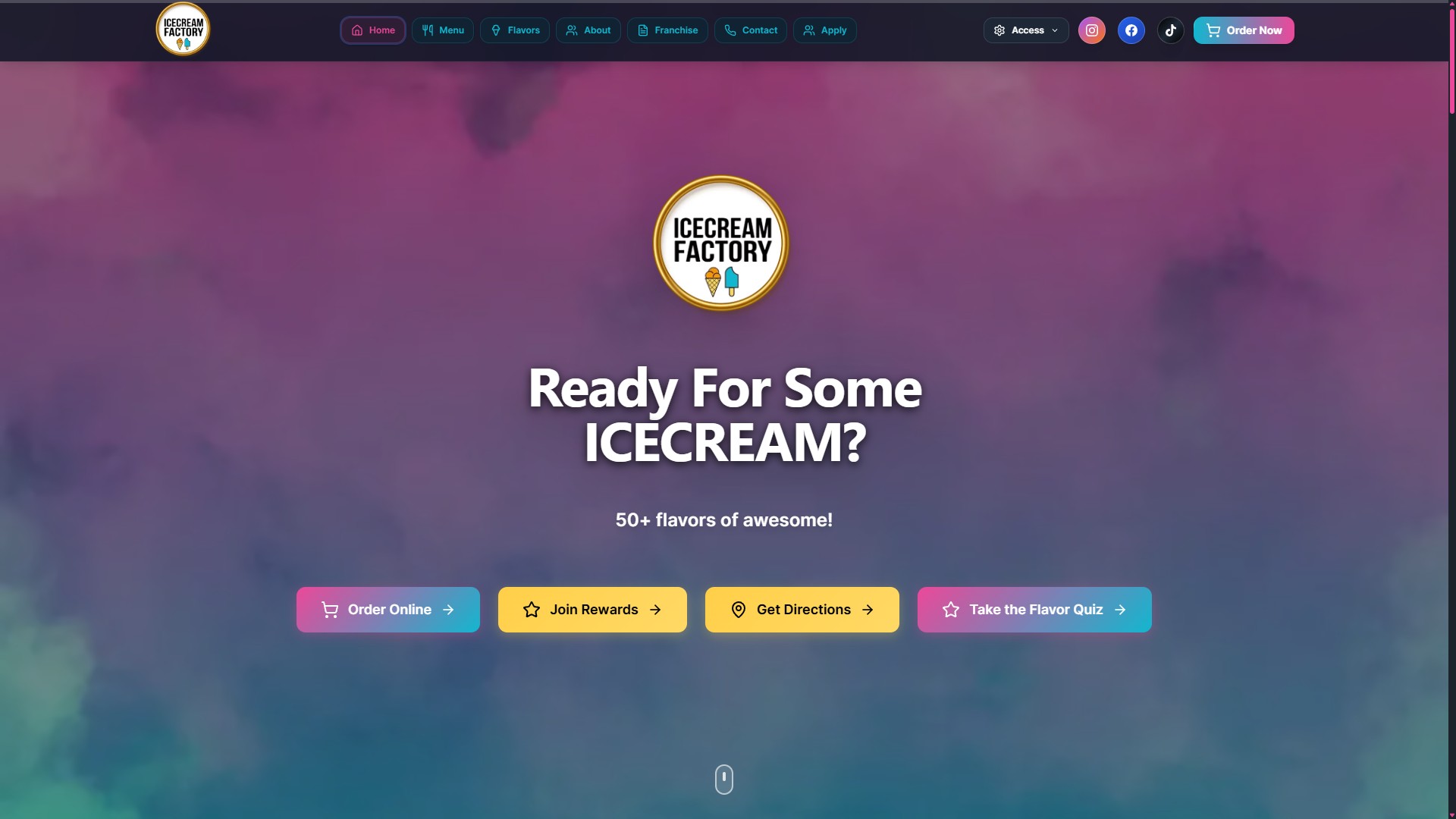
Ice Cream Factory's Digital Growth Story: A Brand Built to Stand Out, Backed by Performance
How Ice Cream Factory transitioned from a self-built Wix site to a professionally managed Next.js platform, achieving strong performance metrics and organic growth in Greensboro, NC.
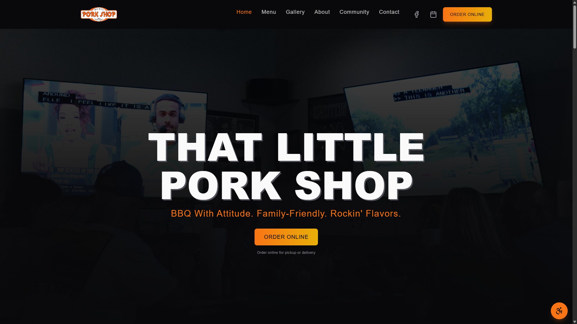
How That Little Pork Shop Transformed a Broken Website Into a Digital Success Story
How That Little Pork Shop transformed from a broken IONOS template to a custom Next.js website that increased online visibility, improved local SEO, and converted more customers in Eden, NC.
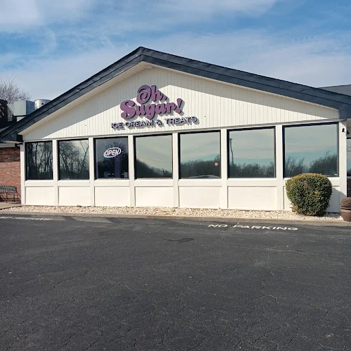
How Oh Sugar Became One of Eden's Sweetest Success Stories
Discover how Oh Sugar transformed from a small restaurant to Eden's top-ranked restaurant destination through strategic web design, SEO optimization, and community partnerships including their 2-year anniversary fundraiser for Morehead High School.