Most designers treat content like luggage, something to pack after the layout is done. They design beautiful frameworks, then hand writers a template to fill.
The problem? Users don't experience layout. They experience meaning.
No one visits your site to admire your grid system or typography. They come for information, solutions, or products that content delivers. Design exists to make content digestible, not the other way around.
When content is afterthought, disconnect emerges. Designers create spaces assuming certain content lengths. Writers receive templates forcing awkward compromises. Headlines get artificially shortened. Copy gets padded to fill space. Nothing feels natural because it wasn't designed around actual message.
Content-first design flips this broken process. Start with words. Understand the story. Structure information logically. Then create design serving that specific content rather than generic layouts hoping content will fit.
This approach requires humility from designers who prefer starting with visual frameworks. It requires early collaboration that feels inefficient initially. But it produces experiences that feel cohesive because design and content were built together rather than forced together.
Let me show you why content-first design matters, how to implement it, and why this approach creates better experiences than design-first workflows that dominated for decades.
Why Content-First Design Matters
Understanding the why prevents treating content-first as trend rather than fundamental principle.
Users consume meaning not visual design. When someone lands on your pricing page, they want to understand options and make decisions. They don't consciously evaluate your layout.
Beautiful design that obscures meaning fails users. Clear content in mediocre design serves users better than gorgeous confusion.
Design should enhance comprehension, not exist independently of it.
Content length unpredictability breaks rigid templates. Real headlines might be four words or fourteen words. Real body copy might need 100 words or 500 words to explain properly.
Generic layouts assume average lengths. When real content varies from assumptions, designers artificially pad short content or cut long content. Both compromises damage communication.
Content-first design adapts to actual message needs rather than forcing content into predetermined spaces.
Story flow determines effective structure. Some topics require linear progression: first understand A, then B, then C. Some require hub structure: central concept with supporting details branching out.
Layout should support natural information flow for specific content, not impose generic structure onto any topic.
Message hierarchy varies by content. Sometimes primary message is headline. Sometimes it's visual. Sometimes it's comparison table. Sometimes it's testimonial.
Design-first approaches assume hierarchy (headline, subheadline, body, CTA) without knowing which elements actually matter for specific content.
Content-first starts with understanding what matters, then creates visual hierarchy reflecting actual importance.
Brand voice comes through content, not just visual identity. How you write matters as much as how things look. But design-first workflows treat copy as filler until late in process.
By the time writers join, design constrains voice options. Short headlines required. Formal tone expected. Playful language doesn't fit serious visual treatment.
Starting with content allows voice and visual identity to develop in harmony.
The Experience Truth
Users remember what you said, not how it looked. Six months after visiting, they might recall your helpful guide or clear explanation. They won't recall your grid system. Content creates lasting impression. Design enables or hinders that impression.
Content-first isn't writers taking over design process. It's recognizing that content creates user experience design should serve.
The Design-First Workflow Problems
Traditional design-first process creates predictable problems that content-first solves.
Problem 1: Lorem ipsum design divorces layout from meaning:
Designers create layouts using placeholder text. These look beautiful in presentations because perfect lorem ipsum perfectly fills designed spaces.
Real content doesn't cooperate. Headlines that looked balanced with "Lorem Ipsum Dolor Sit Amet" break awkwardly when actual headline is "How Our Process Works."
Suddenly that layout doesn't work. Either headline needs to be artificially lengthened, or design needs to be modified. Neither is ideal because they weren't created together.
Problem 2: Writer constraints force awkward content:
"Make this headline 6 words" or "Write exactly 150 words for this section" optimizes for design rather than communication.
Writers contort messages to fit spaces. Important details get cut. Unnecessary fluff gets added. The result sounds unnatural because it prioritizes format over message.
Problem 3: Late-stage content changes require design rework:
When writers finally see designs late in process, they realize messaging doesn't match. Key points need emphasis. Order should be different. Entirely new sections are needed.
These changes require design revisions creating delays, budget overruns, and finger-pointing about whose fault the disconnect is.
Problem 4: Separated strategy treats design and content as independent:
Designers optimize for visual hierarchy and user flow. Writers optimize for message clarity and persuasion. Both work independently, then try to merge.
The merge is always messy because strategic decisions get made separately. Design emphasizes different elements than content strategy requires.
Problem 5: Review inefficiency wastes rounds on wrong things:
Stakeholder reviews of lorem ipsum designs generate feedback about aesthetics rather than substance. Everyone approves beautiful placeholder designs.
Then real content arrives and stakeholders realize messaging doesn't work. New rounds of review focus on content, requiring design changes. The process repeats unnecessarily.
The Template Trap
Reusable templates attempt to solve content-first challenges by creating flexible layouts accommodating variable content. But templates still assume structure before understanding specific message needs. They're better than rigid designs but inferior to purpose-built layouts for specific content.
Design-first workflow systematically creates problems content-first prevents.
Content-First Process Fundamentals
Implementing content-first design requires process changes, not just philosophy shifts.
Start with purpose before any design or writing:
What should users understand, believe, or do after experiencing this content? This goal guides both content and design decisions.
Without clear purpose, you're decorating noise. With clear purpose, every decision has criterion.
Content outline comes first:
Before any visual work, outline actual content:
- What topics does this cover?
- What order makes sense?
- What's the core message of each section?
- What supporting details are needed?
- What examples or evidence matter?
This outline isn't final content. It's structure showing what content will actually say, enabling design to support it.
Rough draft before wireframes:
Write rough draft of actual content. It doesn't need to be perfect. It needs to be real words saying real things.
This shows actual headline lengths, paragraph rhythms, list vs. narrative structures, and content density.
Now designers can create layouts serving this specific content rather than hypothetical generic content.
Content and design collaboration happens simultaneously:
Writers and designers work together iteratively. Writer drafts section. Designer explores layouts supporting that content. Writer refines based on what works visually. Designer adjusts to messaging changes.
This back-and-forth feels less efficient than parallel work, but it produces better integration faster overall.
Wireframes with real headlines show actual space needs:
Low-fidelity wireframes should use actual headlines and representative content length, not lorem ipsum. This reveals whether structure works for real content.
"Premium Package" takes much less space than "Comprehensive White-Glove Service Including Everything You Need to Launch Successfully." Design must accommodate real headline, not idealized short one.
Visual design enhances meaning after content is clear:
Once content and structure are established, visual design makes meaning clearer through:
- Typography emphasizing important words
- Color guiding attention to key sections
- Imagery reinforcing concepts
- Spacing showing relationships
- Layout revealing hierarchy
Design choices have purpose beyond aesthetics because they serve specific content needs.
The Draft Quality
Content doesn't need to be final before design starts. It needs to be real. Rough drafts with actual concepts, representative lengths, and true structure enable appropriate design. Polish happens after content and design align on meaning.
Content-first process requires designers and writers collaborating from start rather than working independently then merging.
Practical Content-First Techniques
Specific techniques make content-first design practical rather than aspirational.
Content templates provide structure without constraining meaning:
Instead of visual templates, create content templates outlining:
- Required information to cover
- Suggested order of concepts
- Purpose of each section
- Audience questions to address
Writers fill content templates. Designers then create layouts for that specific content.
Modular content blocks enable flexibility:
Design components (not full layouts) for common content patterns:
- Text-heavy explanation blocks
- Comparison tables
- Testimonial displays
- Image galleries
- Call-out boxes
- Step-by-step processes
Writers compose from available blocks based on content needs. Designers create new blocks when content requires patterns that don't exist.
Progressive fidelity builds detail gradually:
- Bullet point outline (content only)
- Rough draft with actual sentences (content refinement)
- Low-fidelity wireframe with rough draft (structure validation)
- Revised content based on structure (content-design alignment)
- High-fidelity design with near-final content (visual polish)
Each stage informs the next without premature commitment to specifics that might not work.
Content-first mockups show real material from start:
Even early design explorations use representative real content instead of lorem ipsum. This might be rough draft or content from similar projects showing actual patterns.
The goal is revealing how real content behaves in proposed layouts.
Content audits before redesigns:
When redesigning existing sites, audit current content first:
- What content exists?
- What's still relevant?
- What's missing?
- What needs updating?
- What should be removed?
This audit informs design by showing what content actually needs to exist rather than designing around assumptions.
Writer-designer pairing on complex pages:
For critical pages (homepage, core service pages, pricing), assign specific writer-designer pairs working in tight collaboration rather than assembly line process.
This pairing builds shared understanding that produces integrated results.
The Collaboration Time
Content-first requires more early collaboration time. But it eliminates late-stage rework from misaligned content and design. Total time-to-launch is often shorter and always less frustrating because major disconnects don't occur.
These techniques make content-first practical for real projects under real constraints.
Designing for Content Variability
Content-first design must accommodate content evolution without requiring design revisions.
Flexible hierarchies allow content to adapt:
Design heading systems that work for various content lengths. H2s might be one line or three lines. Layout must handle both gracefully.
Avoid rigid layouts requiring specific content lengths to look correct.
Spacing systems scale naturally:
Use relative spacing (ems or rems) instead of fixed pixels. This allows content blocks to grow or shrink proportionally as content changes.
When product descriptions grow from 50 to 75 words, layout shouldn't break.
Grid flexibility accommodates varied content types:
Some sections might be text-heavy. Others image-heavy. Some need comparison tables. Others need testimonials.
Grid system should support varied content patterns without looking disjointed.
Component-based design enables content-driven composition:
Design systems of components that writers can combine based on content needs rather than locked-in templates.
If story requires two examples instead of three, layout accommodates without redesign.
Breakpoint content strategy adapts to device context:
Mobile users might get summarized version with link to full details. Desktop users see complete content immediately.
This recognizes content needs vary by device context, not just visual space available.
CMS flexibility allows content creators to build pages:
Modern CMSs enable content creators to assemble pages from designed components without developer involvement.
This content flexibility requires more upfront design work creating component library but enables ongoing content adaptation without design bottlenecks.
The Flexibility Balance
Too much flexibility creates inconsistency. Too little creates constraints. Content-first design establishes enough flexibility for real content variance without enabling incoherent layouts from unmindful component mixing.
Design systems should enable content to evolve without constant design revisions.
Typography as Content Enhancement
Typography choices directly affect content comprehension and should serve content needs.
Type scale reflects content hierarchy:
Heading sizes should distinguish clearly between importance levels. But specific sizes depend on content depth.
A site with two heading levels needs different scale than one with five levels. Type scale emerges from actual content structure.
Line length optimizes for reading comfort:
45-75 characters per line maximizes readability for long-form content. Narrower for mobile. Wider acceptable for short bursts like headlines.
But optimal length varies by content type and reading context. Design should optimize for actual content being read.
Line height creates appropriate density:
Long-form reading benefits from generous line height (1.5-1.8). Short promotional copy tolerates tighter leading. Legal text often needs extra space for scanning.
Line height should serve content's reading pattern, not just look balanced.
Font choice matches content voice:
Serious technical content might require neutral fonts. Creative agency content might use distinctive typography. Financial services need trustworthy, traditional fonts.
Typography carries voice that should align with content tone.
Text formatting guides attention:
Bold emphasizes key points. Italics add nuance or introduce terms. Font size creates hierarchy. Color directs focus.
These formatting choices should emerge from content needs: what deserves emphasis? What needs clarification? What's primary vs. secondary?
Responsive typography adapts to device contexts:
Mobile might need larger minimum font size for readability. Desktop can use broader type scale. Tablets might benefit from adjusted line length.
Responsive typography should optimize for how content is actually consumed at each size.
The Readability First Principle
Beautiful typography that's difficult to read fails users. Readable typography that's aesthetically mediocre serves users. Prioritize comprehension over aesthetics when they conflict. Fortunately, they rarely conflict when design serves content purpose.
Typography should make content easier to consume, not just aesthetically pleasing independent of content.
Visual Content Integration
Images, videos, and diagrams aren't decorative additions. They're content that design must integrate purposefully.
Content-supporting imagery clarifies rather than decorates:
Generic stock photos add nothing. Specific images illustrating concepts, showing products, or providing examples enhance understanding.
Image selection should start with "what does this image communicate?" not "what looks nice here?"
Image placement follows content flow:
Images should appear near related text. Process diagrams should precede or follow process explanations. Product images should accompany product descriptions.
Layout should place images where they enhance comprehension, not just where they balance composition.
Visual hierarchy can elevate images when appropriate:
Sometimes image is primary message (portfolio work, product features). Sometimes text is primary with images supporting.
Hierarchy should reflect actual importance in content strategy, not default to text-first or image-first pattern.
Captions and alt text complete visual content:
Images without context create confusion. Captions clarify what users should notice. Alt text serves screen reader users and SEO.
These text elements are content that design must accommodate, not afterthoughts.
Charts and diagrams visualize complex information:
Some concepts explain better visually than textually. Data comparisons benefit from charts. Process explanations benefit from diagrams.
Content strategy should identify opportunities for visual explanation, then design creates those visuals as integral content.
Video integration requires content context:
Video thumbnails should suggest content. Transcripts should accompany videos for accessibility. Context should explain what video contains before users invest time watching.
Design must support video as primary content type, not just embedding player in layout.
The Visual Content Ratio
There's no universal correct image-to-text ratio. It depends entirely on content needs. Portfolio requires high image density. Thought leadership might need fewer images with more text. Let content purpose guide ratio, not design preference.
Visual content is content that design process must consider from start, not decorative elements added at end.
Converting Stakeholders to Content-First
Designers and clients used to design-first workflows resist content-first because it feels slower initially.
Demonstrate problems with design-first:
Show examples where lorem ipsum designs looked great but real content broke layouts. Highlight how many revision rounds occurred fixing disconnects.
Concrete examples of pain caused by design-first build appetite for alternatives.
Show content-first success from other projects:
Case studies demonstrating faster overall timelines, fewer revision rounds, and better outcomes help stakeholders see value.
If you're converting your own process, document first content-first project results to convince future skeptics.
Start small with pilot projects:
Don't overhaul entire process for largest project. Test content-first on smaller project where risks are manageable and benefits are demonstrable.
Success on small project builds confidence for broader adoption.
Frame as efficiency not extra work:
Content-first frontloads collaboration but eliminates late-stage rework. Present as process improvement reducing total time and frustration.
Emphasize fewer revision rounds, better first drafts, and reduced back-and-forth between teams.
Address designer concerns about constraints:
Designers fear content-first limits creativity. Reality is opposite: understanding specific content enables more appropriate creative solutions than generic layouts.
Reassure that content-first guides design rather than constraining it.
Set clear expectations about timing:
Content-first requires content earlier. Writers need time to draft. This feels like delay compared to design-first where design happens immediately.
Build realistic timelines accounting for content development so early phase doesn't feel slower than necessary.
The Cultural Shift
Content-first requires organizational culture valuing collaboration over specialization silos. Some resistance comes from protecting turf or workflow comfort. Address cultural resistance with leadership buy-in and demonstrated results, not just process documentation.
Converting stakeholders requires patience, evidence, and addressing specific concerns rather than forcing new process.
Tools Supporting Content-First Workflows
Technology can facilitate content-first collaboration when chosen appropriately.
Collaborative writing tools enable real-time iteration:
Google Docs, Notion, or Dropbox Paper allow writers and designers to collaborate on content simultaneously, adding comments and suggestions inline.
This real-time collaboration supports iterative refinement content-first requires.
Design tools with content features:
Figma and other modern design tools allow linking to external content sources, making it easier to design with real content rather than placeholder text.
Some tools enable content sheets where real copy exists and syncs into designs automatically.
Content management systems with preview capabilities:
CMSs showing how content will appear in actual layouts help writers understand space constraints and designers see real content behavior.
Preview environments bridge gap between content creation and visual presentation.
Style guide tools document content and design standards:
Tools like Storybook, Pattern Lab, or Fractal create living style guides showing components with real content examples.
This documentation helps teams understand how content and design work together systematically.
Project management tools coordinate collaboration:
Clear task dependencies (content draft before design mockup, for example) in tools like Asana, Monday, or Linear keep teams aligned on process.
Good project management prevents premature design work and ensures collaboration happens at right times.
Version control tracks content and design together:
Using Git for both content and design files creates single source of truth where changes are tracked together rather than in separate systems.
The Tool Trap
Tools facilitate but don't create content-first workflows. Process and collaboration mindset matter more than technology. Simple tools used collaboratively outperform sophisticated tools used in isolation.
Choose tools supporting collaboration and iteration rather than reinforcing siloed workflows.
Conclusion: Content Creates Experience
Design is not decoration. It's enhancement of meaning.
When design comes first, we hope content will fit. Sometimes it does. Often it doesn't. Always there's compromise because pieces weren't designed together.
When content comes first, design serves specific purpose: making this particular message clear for this specific audience pursuing these defined goals.
The result feels cohesive because it is cohesive. Content and design weren't forced together. They were built together.
This requires designers to set aside ego that treats content as constraint. It requires writers to collaborate earlier when drafts are rough and uncomfortable to share. It requires stakeholders to understand that content-first frontloads work but accelerates overall progress.
The payoff is experiences that feel intentional rather than templated. Pages where every element serves purpose. Layouts that enhance rather than compete with meaning.
Users don't visit websites to experience design. They come for content. Design's job is making that content effective.
Start with content. Design from meaning. Build experiences that feel complete because they were conceived as wholes rather than assembled from separate pieces.
That's not slower path to launch. It's only path to coherence.
Design with content, not around it.
That's how meaning becomes experience.

Related Posts
The Psychology of Pricing Design
Pricing is communication. Before customers read features, they feel value through presentation. Learn how design choices influence pricing perception and decisions.
Mobile-First Design: When Simplicity Becomes Laziness
Mobile-first design started as smart prioritization but evolved into creative laziness. Learn how to build responsive experiences that scale emotion, not strip it away.
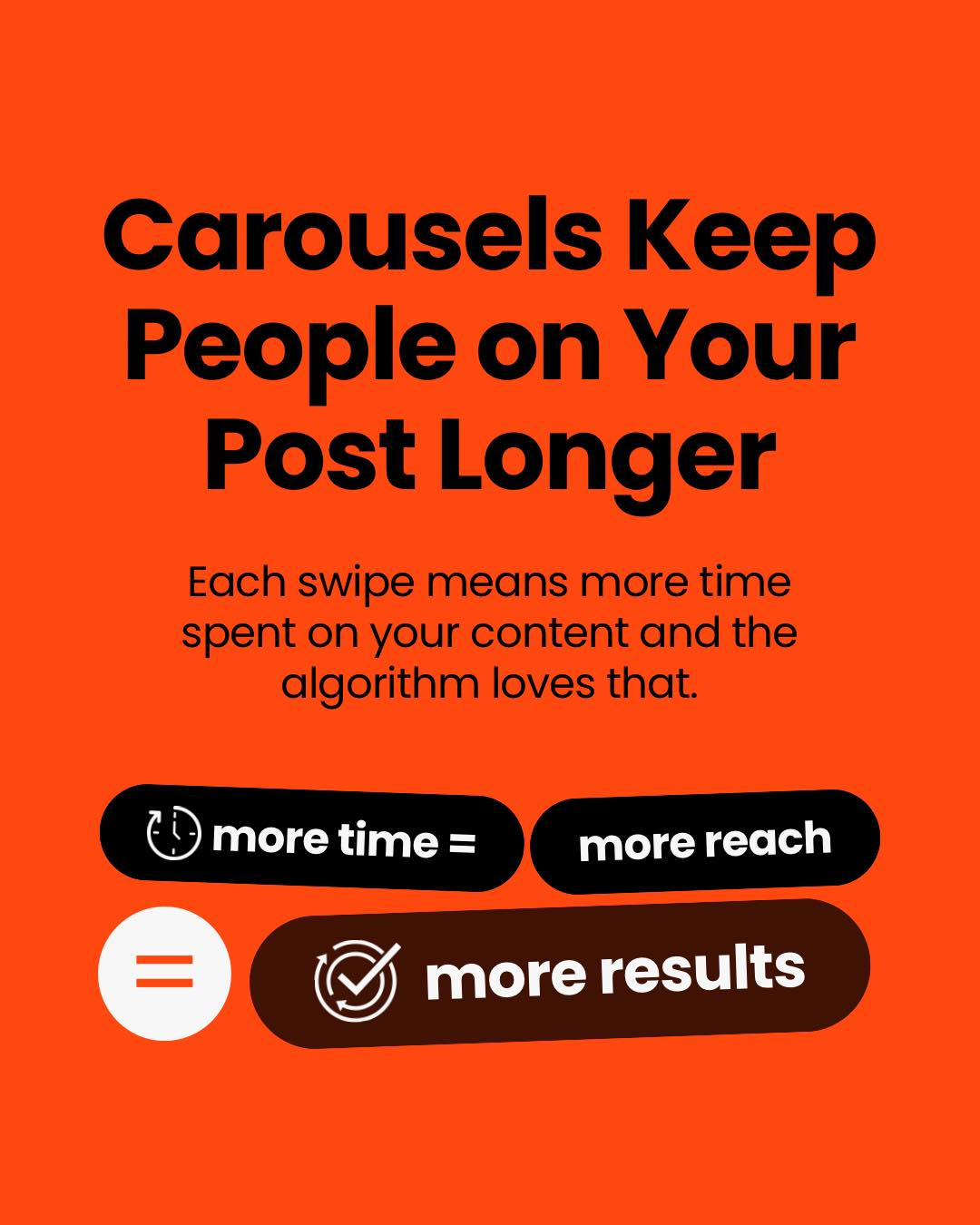
Carousel Posts as a Structural Advantage in Social Media: A Comprehensive Analysis of Engagement, Algorithms, and Strategic Communication
Discover why carousel posts outperform single-image content through cognitive science, algorithmic optimization, and strategic information architecture. Learn how to leverage carousel content for sustainable digital growth.